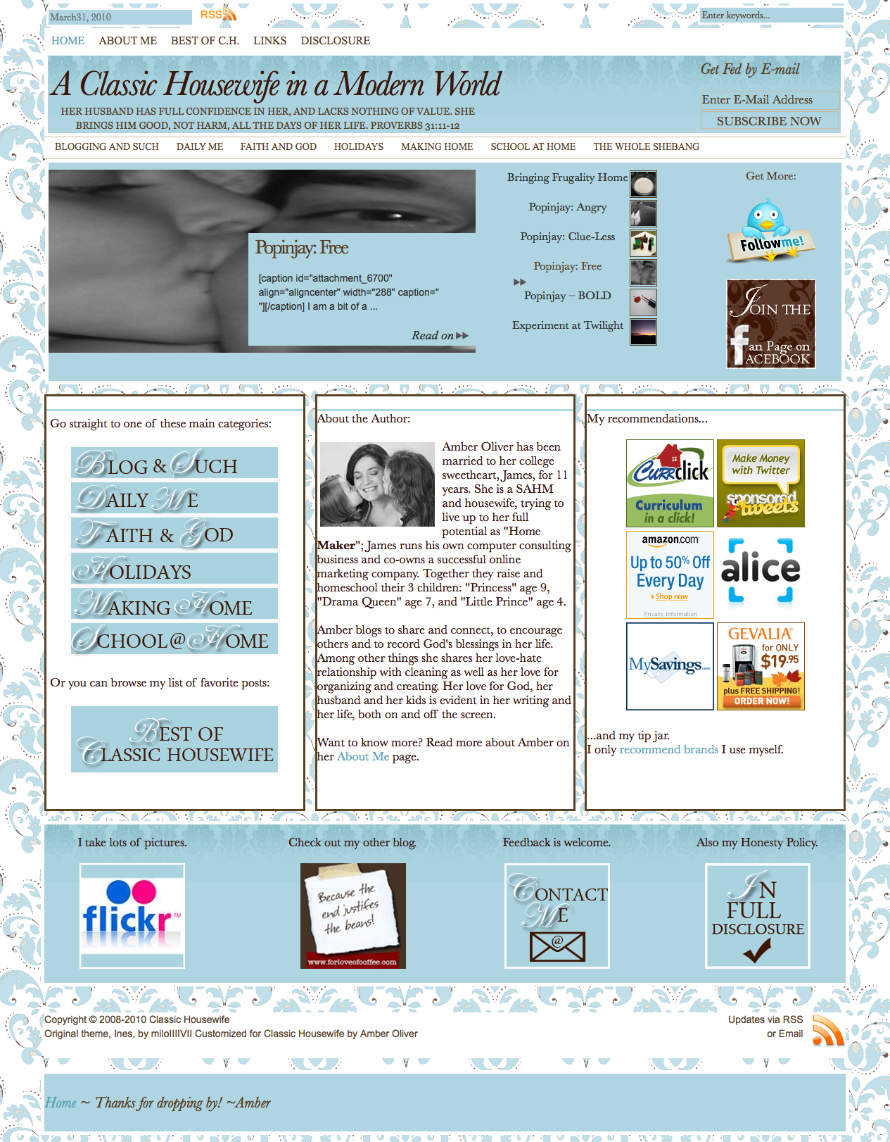
This is no April Fool’s joke! Weeks and weeks, nay, months and months of work and has finally come together and jelled into a giant plate of sweetness surpassing even a Jell-O No Bake Oreo Dessert. And THAT’s saying a LOT!

If you’re reading this through a feed reader, hop over and take a look at my new blog design!
I think I’ve got all of the technical kinks worked out but I’ve found a few teeny design things I still need to work out:
- The text in the middle column on the front is still bumped up against the left border.
- I need commas between the categories in the post hierarchy at the top of each post.
- There are little numerals to the left of each comment AND big numbers to the right, need to remove the little ones.
- The bullet points for trackbacks (listed under the comments section) is outside of the left border.
- Font on archives page is different than font on all the other pages.
I could actually use a little bit of audience participation on this. Are you up for it?
Of course I’ve tested this in various browsers and screen resolutions, but if for some reason things look a little off or wonky – please, please let me know about it? Make sure to let me know what web browser you use and what screen resolution you have also.
And while you’re at it, if you see anything else that needs tweaking, won’t you leave a comment and tell me? Anything, anything at all. If you think the italic font is too hard to read, if you find it hard to get around from page to page. ANYTHING. I especially want to know if you hit a 404 page for anything, or if images don’t pull up. I want to know if the site takes too long to load or content and images get cut off. You get this idea. This is your one opportunity to let me have it with complete amnesty. ;0)
… Oh – it’s important to note that there was a little bit of restructuring done yesterday. The majority of you will never even notice. A few of you may find that your feed subscriptions have altered a bit – as they’ve all been merged back into one. I don’t think you’ll get duplicates, but if you do – you may need to go in and edit your subscriptions. Or let me know and I’ll see if I can help you with! …
Isn’t this exciting? I know I think so! And I have a whole bunch of things to write about swimming around in my head, too. I’m going to have to pace myself. ;0) So enough from me – what do YOU think??
Edited: So far you have said the following…
- Adjust font size for headings so they have enough room at lower resolutions (should be better?)
- Text in 3 columns on front page get cut off at lower resolutions
- Need a space between month & day in date at the top (also on posts and category pages)
- The arrows pointing to the post titles in the content slider are weird, not lined up with the titles (yeah – they are. Original styling, I haven’t tweaked that but I can/will.)
Don’t hesitate to mention more… here in the comments or send me an email, either is fine. Thanks!

I think your new look is very nice! Fresh too! 🙂
I love it. It looks pretty much the same to me as it does in your screen shot. and I LOVE it. It looks pretty, and clean, and so nice. So far i don’t notice any glitches or anything like that. I’ll let you know if I come across any, but for now, TWO thumbs up! 😉
Hooray for you!!! It turned out GREAT Amber!
[…] my new blog design (which I’ve spent the last few months working on and was at first the only thing I could […]